Showing posts with label Frances. Show all posts

Friday, 11 March 2016

Final Outcomes


TRAILER

This is our final Trailer

POSTER

This is our Poster

Magazine Cover

This our Magazine Cover


Monday, 29 February 2016

Task 25: Evaluation Question Four


Evaluation 

Question four:

How did you use media technologies in the construction and research, planning and evaluation stages?


Sunday, 28 February 2016

Task 24: Evaluation Question Three


We asked a few of our peer mates some questions about their thoughts on our products (trailer, poster and magazine cover). It is useful to get peer review as it can help you see what you may have missed evaluating the trailer yourself, giving a fresh outlook on your products.

Through this we found that our best products, those that received most compliments and needed the fewest improvements, were our magazine cover and poster. Our trailer received compliments on the editing, sound, acting and filming techniques. However, some described it as perhaps giving too much information away, if they had to change anything they would have preferred it to be shorter. Although we did have some people say that they thought it was the right length as they were still interested enough to want to watch the whole film.

Saturday, 27 February 2016

Task 23: Evaluation Question Two


Evaluation 

Question Two:

How effective is the combination of your main product and your ancillary texts?


Friday, 26 February 2016

Task 22: Evaluation Question One


Evaluation 

Question One:

In what ways does your media product use, develop or challenge forms and conventions of real media products?


Wednesday, 3 February 2016

Task 21: Film Poster Editing Process


This is our Finished Film Poster


This is our editing process for our film poster


This is the original photo which we took in a studio at our school. Its quiet similar to our magazine photo yet its a closer shot of their face so it will draw in more audience members as it seems more emotional. 


During the editing process we first changed the colour of the image. We put on a pink tint to enhance the colour of Isobel's hair and then used the colour balance and enhanced the pink tones. The pink tones allow the poster to seem more appealing to the eye and it doesn't seem to harsh. This allows our target audience to have an idea that our film is romantic/drama. 


We took inspiration from 'The Fault In Our Stars' as it follows a similar story to our trailer. the cloud was cut using the 'Lasso Tool' then we refined the edge so it blended into the poster slightly so it didn't have a harsh edge.We also added the title of the film yet cut the title from word so we could have a specific font style which is in the final poster.


This is the poster that we got our inspiration from as we liked the effect of the clouds blending together. It creates a sense of innocence and romance. We also liked the font used as it looks hand drawn which may catch the attention of young viewers targeting their  audience well. 


When we edited the title and layered it in front of the cloud we were left with this. it looked great but other elements needed to be added for it to look professional.


By adding a line at the top saying 'BASED ON BEST SELLING NOVEL 'BOUND TOGETHER'. This is synergy as we also included this line/feature in our trailer. Furthermore, the names of those who were involved in the making of the trailer and the date it will be released on are at the bottom of our poster this made it look realistic and it was our finished product. We chose the 14th of February from the choice of our genre (drama/romance) so it would be the best decision to release our film on Valentines day.


Thursday, 28 January 2016

Task 20: Editing process Magazine cover


This is our finished Magazine cover


This is our evidence for our editing process


First of all we went to our photography studio at school and took a variety of photos of our main actresses from our movie 'Boundless' in different positions. By having many options this allowed us to pick the best one. We chose this one because it captures the main theme of our film which is romance. We were inspired by other Entertainment film magazine covers that also use their main characters showing a positive relationship. In this photo you can see that we had individually cropped each letter and placed it behind layer 1 which was the image of Isobel and Adara. We used the Quick selection tool to select Isobel and Adara then used refine edge to soften out any rough edges, we used this tool to select Isobel's hair to create defined detail in the photo. We copied and pasted this selection to create a new layer to go over the top of 'Entertainment'. 


To be able for our film title 'Boundless' to be the same colour at the magazines name 'Entertainment' we had to use the eye drop tool which selected the same red to use. This gave it a professional appearance not looking rushed and messy.


We decided to take ideas from other 'Entertainment' magazines on what to write on the front cover. We thought adding 'Exclusive Interview' with the stars of our film would be a good way of attracting our target audience as it would be a personal and up close moment for fans of the film. We chose to put the words 'Exclusive Interview' in a cream/brownish box as that is what most Entertainment magazines did. For the words to stand out as it was an important message.


Again from searching for many entertainment magazines we found they appeared to have a sticker that would announce an important message that appeared inside the magazine. This would attract audience members to buy it. We added a similar small circle as drawing a circle and filling it in with a dark grey was easy and gave it an extra touch making it appear more professional.


We then added a spotted outline and words that were thinner than any other font to add contrast in our magazine.


 For our magazine to look realistic we added a price of £2.99 and a barcode which was found on google images.


We also added at date from when it had been published to when it expires.


For our actresses to be known for their name and not just faces we added their name in a smaller print as well. Most of 'Entertainments' magazines have the actor's name somewhere on the front page for information of readers.


We also needed to add something in the bottom left corner as it seemed slightly bare. So we added a question that relates to our theme. 


However, the red colour didn't work so we used the brownish box to go behind the words and changed the font colour to white for it to stand out yet still fit the theme colours that we had used throughout the whole process.


Wednesday, 27 January 2016

Task 19: Magazine Cover-Entertainment


Why we picked Entertainment weekly:

We chose to produce our magazine cover in the style of Entertainment Weekly's as we felt that Entertainment showcase the most amount of romance/drama films on their front pages. We liked the colour schemes that they use as they use soft colours such a white, cream and pale blue. Yet also use a lot of red particularly for the title, symbolising love and romance themes.
AS we want our magazine cover to look romantic and emotional we also want to use colours similar  to theirs, and have a similar main image, of a couple very close to each together. We want our magazine cover to have a professional appearance therefore we will use the same fonts that Entertainment use and also recreate many of their reoccurring imagery such as small coloured circles with text in to grab the readers attention.

Wednesday, 20 January 2016

Task18a: Editing Process 2

We added this insert of text throughout our trailer to advertise that anyone who has read the book may be interested in our film. We wanted to create clear links to our poster as we advertised that it is also from a best selling novel. This is an example of synergy.
This is an example of one of the reviews to allow the audience to know that its a exciting up coming movie worth going to see.
We needed to add details of when the movie was coming out for the audience to know when they can see it. We used valentines day as it links with the romance/drama genre of our trailer.
This is the end credits which needs to be added on all trailers for any other important information. Also allows everyone to know who was involved in the trailer and the name of the film.
This is our logo which we added in our trailer on the end credits, so the audience know who produced the trailer, this also links to our film poster, this is synergy.


Tuesday, 19 January 2016

Task 18: Editing Process

Editing Process


Fade to colour:
We used the Fade to Colour transition to join scenes and make them flow seamlessly. These fades created a more dramatic effect, and gave the audience more time to take in what was happening in the scenes. These fades created a time lapse, showing a series of events quickly to create a narrative. 
It also created a typical 'romantic drama' effect, as these fades are typically used in romance and drama trailers. 


Fading out music:
As we are using two songs in our trailer we needed to fade them out smoothly so that it doesn't sound awkward or have a silent gap. We decided to fade out The Hunger Games instrumental song before the flashback clips. We did this by cutting the sound by using the blade tool, then lowering the volume on each small sound clip. Then we added the Keane song, 'Bedshaped' underneath the faded out song, making them flow seamlessly into each other.


Editing sound:
We edited the sound of the clip when Bella and her mum are in the kitchen, we wanted to make this clip very emotional therefore we cut the sound out of the end of the clip. By cutting the sound it created a tense and emotional atmosphere and you can just hear the music.  


Opening logo:
We created an opening logo a while ago therefore it was easy to import into our trailer. We added some text on top to create our name, 'BreakFocus', this text fades in and out creating a smooth transition. 


Thursday, 14 January 2016

Task 17: Soundtrack Alteration

The Hunger Games Soundtrack


After we started to edit our trailer we decided that we needed some music in the background of the start of the trailer. As we are using the song 'Bedshaped' by Keane towards the end of the trailer we needed something to fill the silence. We  decided to listen to the first Hunger Games soundtrack to find an instrumental song that would work well with our theme. 
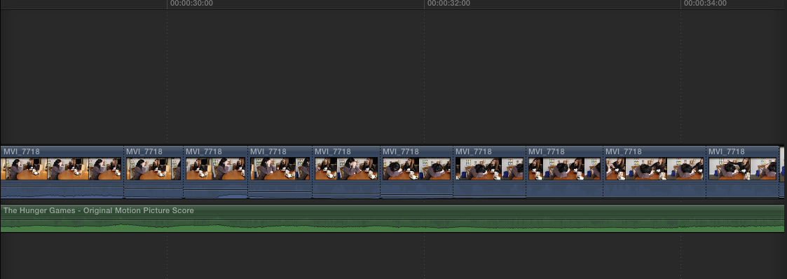
We found the perfect song, called 'We Could Go Home':


This song works perfectly with our trailer as it starts off quietly then gradually gets louder, its a calming yet emotional song working well with our theme. It is also not noticeably from the Hunger Games  as its not fast paced and doesn't sound 'action' themed. 

Tuesday, 15 December 2015

Task 16: Experimenting With Photoshop


This was an idea we had for our poster or magazine cover although it didn't highlight our romance/drama genre. the blurred image was supposed to illustrate how 'lily' is there to 'Bella' yet not to anyone else. Even though it was an unsuccesful experiment we thought it was best to try a different way of our main characters to be on our poster and magazine cover.

Tuesday, 24 November 2015

Task 15: What Is A Magazine Cover?

A film magazine cover is used to advertise a film. They usually involve features such as:

Masthead: This is on all Magazine covers usually at the top of the page and indicates what magazine it is e.g. Empire or Total Film. This is the largest text on the page and reflects the audience it caters for.

Image: This is usually a photograph, however, in the case of Little White Lies it is a digitally manipulated image in the stye of a painting/drawing. The main image is usually a mid-shot and should reflect what the film is about/ the genre. This involves the main actor/ actors. 

'Buzz words': These involve words such as 'free' or 'exclusive' which capture the audience and readers attention and make them want to buy the magazine. 

Anchorage text: The text that often overlaps the image hinting at what the film will be about, this is sometimes a quote taken from the film.

Banner: Gives overall information about the magazine and what will be found inside.

Barcode, date, issue number: Something every magazine has and is needed.


Empire Magazine:


Empire magazine is a British film magazine issued monthly by Bauer Consumer Media.
It was first published in 1989.
It includes film news, previews and reviews. It also has unique regular features such as a Classic Scene which involves a transcript from a well known film. 
It is the biggest selling film magazine in Britain and is also published in America, Australia, Turkey, Russia and Portugal. 


Little White Lies:


Little White Lies was established in 2005 as a bi-monthly print magazine committed to creating great movies and the people who make them. 
They combine cutting-edge design, illustration and journalism. It has been described as being “at the vanguard of the independent publishing movement.”


Mood Board Of Inspiration:


We created this mood board on Powerpoint, we drew a lot of inspiration from Entertainment Weekly as it often features more romantic and dramatic movies rather than action ones. As we are creating a romantic and emotional trailer we want to portray this in our film poster, therefore we don't want it to appear like an action movie, which Empire magazine usually advertises. 

Thursday, 19 November 2015

Task 14: Examples of Film Posters

Blue is the Warmest Colour

Within this poster there is a clear, simplistic colour scheme which links to the name of the production, making it effective as everything ties in well. The fact that both of the main characters are present in the poster close in this way allows us to immediately understand that it is a love story and perhaps a dramatic one due to the dramatic stance. Visual and verbal aspects within the poster are portrayed equally, meaning that it is not overpowered by too much text which would deter from the images which people are unlikely to read in detail.
There are a few quotes from various critics informing the viewer of the films assets, these opinions allow the audience to see that the film is of good quality and worth their money to go and watch. This is often present in film posters as it makes the film look as if it is already very successful, making it much more attractive to someone who is considering seeing it. The poster, containing two women about to kiss indicates that the production may well be about the controversy surrounding gay relationships in certain places in the world, which will reach a much wider audience as films containing issues such as these are much mrs common and successful in recent years, such as Free Held and Life is Strange.
The fact that the poster portrays a mixture of genres may entice readers as it does not conform to stereotypical love story posters. Additionally, the colour scheme is physically eye catching due to the strong blues against the other, more grey colouring.The ironic title being 'Blue is the warmest colour' links with the muted, cold colours used in the poster, making a clear contrast which is also eye catching at first glance.


Freeheld


This is the poster for the film Freeheld, we are interested in this poster as it deals with similar themes such as homosexual relationships and loss. 

The colours used in this film poster are soft and pure, a lot of white is used suggesting their vulnerable love and purity. Colour isn't a main feature of this poster, as only a segment of colour can be seen. 

We like the placement of the equal symbol as you can clearly see each characters face. The equal sign is a significant symbol as the film is based around the acceptation and equality of homosexuals. Although we like the idea, we don't want to base our poster/trailer around the discrimination of homosexuals as our trailer is based on relationships and dealing with loss rather than society and standing up against discrimination. 

The photograph of the couple in the background is significant as it presents their love and affection for each other, and clearly suggests that the film will be based around a homosexual relationship. We want to use a photograph similar to this, especially the composition, of the two faces very close to each other as we want the audience to know that our film will be about a homosexual couple. We like the use of warm colours contrasting the use of white and may use this colour scheme in our poster. 

The intended audience for the poster may be socially aware individuals and probably would have a larger female audience. This is due to the fact that it is a romantic film and deals with controversial and sensitive issues. We think that our audience will also be primarily female, yet however we are aiming our film towards a younger audience such as female adolescents. 

This poster uses a transparent layer of white over the image which creates this cloudy and 'dreamy' appearance. We really like this technique, particularly as one of our main characters dies so having transparent areas suggests that she is not really there, linking in with the storyline of our film. We will do this technique on photoshop by decreasing the opacity on the characters Lily's face/hand. 

Now Is Good


The main colours in this poster are bright (Blue and yellow) to emphasis the film title especially the word good ('Now Is Good'). As the colours are bright it attracts many people as it stands out from darker shades and colours that other posters may use to advertise their movie.
the only symbol shown on the poster is true affection that is shared between the main two characters. I have seen the film myself and symbols of hate, anger and sorrow is also featured frequently in the film.
The only background or set that is presented on the poster is a blue sky; this sky is seen when the couple are sitting on a bench enjoying the fresh air while enjoying one another's company. The couple visit the bench very often so the blue sky is a memory of theirs. they are also clearly illustrated photographically. A photo of the couple showing physical affection, the main character facing the front while her partner facing the side slightly to  take the lime light off him so the audience know that she is the main character of the film.
The message of sadness is slightly shown as the colour blue portrays slight sorrow yet the bright colours and the visual affection strongly show that the film will consist of love and happiness throughout yet may end sadly. a small quote is featured to advertise the love that is shown in the film "live every moment, love every moment" which gives away that the film may have some adventure to it.
Teenagers or young adults would be attracted to the poster because of the young characters on the front and the bright colours, furthermore, the love shown is known to attract a younger age audience from the romantic storyline it might include.
The young actors featured on the poster really catch my eye because the teenage boy is handsome which will attract many teenagers and the teenage girl is a known actress so people will want to watch it because of those two main reasons.
They don't use a star to sell their film they use their actors names, in bright yellow writing just above the title to make it clear that these are well known actors that are in the film.
No critics are shown only the actors and production companies names that joined together to produce the movie which may be concerning to some people as they have no border to know whether the film is good enough to go and watch.
The only thing that is shown in this poster is true love affection and sadness (from the blue sorrow colour). the poster doesn't give much away which in my opinion is good as it allows the audience to go and watch a film they know so little on so they watch the whole movie without knowing what will happen, although, some people like to know a little more about what they are going to watch so no surprises are there.
This poster helped us think of the main characters faces to be presented on the poster as is really attracts our target audience (young teenage couples). We also like the idea of the bright colours that give off two emotions (light blue presented sorrow yet happiness) and we are wondering whether not to do that as our film name is quite harsh so we think light colours might ruin it slightly.

Thursday, 12 November 2015

Task 13: What Is A Film Poster?

    What Is A Film Poster?
    A film poster is a poster used to advertise a film. Studios often print several posters that vary in size for various domestic and international markets. They normally contain an image with text. Current day posters often feature photographs of the main actors.
    Film posters also need to be artistically interesting, as people buy them to hang on walls as decoration. AS well as them having a commercial purpose to promote an event and product, they also need artistic value.
    The main purpose for film posters is advertisement, to 'sell' the film. Film posters have the title in large, bold writing with images of the films 'attractive' actors. The actors names are usually featured at the bottom of the poster to remind you that the film has big-time stars. Designs, colours and fonts are used to appropriately reflect the mood and genre of the film. The poster sometimes includes a catchy parse from the film or a critics comment, to interest the viewer. 
    Film Poster Examples: Teaser Posters


    Teaser trailers contain basic information such as the title and hint to the genre of the film. They are used to interest the audience and excite them without giving away any of the plot. 

    Main posters:

    Main posters usually contain images of the main actors and the film title. The often hint to the genre and themes of the film, for example these films are all romance/ emotional films and we can see this from the use of colour and imagery. 


    Romance/drama poster mood board:

    We have created a mood board on Photoshop to give us inspiration for the composition, colours and font used in similar romantic drama film posters. 

    WE found that a lot of colours were used, mainly blue and red. White is a colour often used in romantic posters, suggesting innocence and purity.
    Close ups of couples faces are used in almost all of the posters we looked at, as the couple are the main focus of the film.  


Thursday, 5 November 2015

Task 12: Our Company Logo


BreakFocus Logo


We choose the image glass breaking to really emphasise our company's name (BreakFocus). By adding a slow motion effect this allows the audience to pay more attention to the screen as it lasts slightly longer than other company logos which just flash onto the screen. No noise is needed as we want the audience to focus on and remember the name of our company .

We also added our film production name at the end to make it clear that its a production from 'BreakFocus'. We wanted it to gradually appear then to almost fade away but stay blurry, which we were able to do on final cut pro. We have also got feedback from family members and friends on our logo and they really like the idea of how the image breaking and the company name link well together as its easier to remember the company. 

It was quite hard to think of a company name and a logo but as soon as we thought of a good catchy film production name it was clear that we wanted a  breaking/smashing moving image to complement our film business. 

When doing research into other existing logos, we liked the idea of having a simplistic logo, much like that of working title and Lionsgate. however, while having this in mind, we also wanted it to strongly relate to the actual name of our production company. From this, we decided to use a glass smashing which is simple, high impact and has a clear link to our name.


Still Logo:

We also created a still logo that we can use in our trailer for reviews and any text we need to include.
We used the same breaking glass imagery for this as we wanted the audience to see a clear link and show synergy. 
We created this logo through photoshop, adding the image and then inserting text. 


Tuesday, 3 November 2015

Task 11: Script

BOUNDLESS SCRIPT


INTER-TITLE- BREAKFOCUS LOGO


INT. FRONT ROOM. DAYTIME. 4PM.

MID SHOT- SETS THE TONE OF THE TRAILER (UNDERSTANDABLE/RELATABLE AND EMOTIONAL ATMOSPHERE) 

BELLA and LILY are facing each other having an argument on the sofa, muffled conversation heard, voices become raised. 
LILY
- - I can’t believe you would do that - -

BELLA
- - You’re overreacting, it’s not that bad - -

LILY
- - I’ve had enough ! - -


LONG SHOT-  LILY STORMS OFF ANGRILY AND LEAVES THE ROOM (TENSE ATMOSPHERE)

Diagetic sound of footsteps and a slamming door.

BELLA stays sitting on the sofa, camera pans from the slamming door to BELLA, portraying her hurt facial expression. 


INT. BEDROOM- NIGHT TIME

MID SHOT OF WHEN LILY ENTERS THE ROOM

LILY slowly walks over to BELLA as she’s on the bed she leans down to wake her up.


LILY
(whispers)
- - I’m sorry for walking out earlier, I just needed to cool off - -

BELLA
- - It’s ok, don’t worry about it - -
BIRDS EYE VIEW SHOT OF THEM IN BED

LILY gets into bed, next to BELLA and they hug.


INT. BEDROOM- MORNING

BELLA in bed alone, looks around for LILY. 

BELLA
- - Lily ? - - 

MUM
- - Bella, are you awake? I need to speak to you - - 

BELLA walks out of the bedroom.


INT. DINING ROOM - MORNING

MUM  is sitting at a table, with the phone next to her hand. BELLA enters the room and she doesn’t look at her. As soon as she sees her, she breaks into tears

MUM
- - Bella, i’m so sorry - - 

BELLA
- - What are you talking about - - 

MUM
- - Its Lily, she’s been killed in an accident - - 

All noise is muffled and a high pitched ringing noise can be heard.

EXT - STREET OUTSIDE THE HOUSE - DAYTIME 

Shows flash of LILY being hit by the car, then cuts to black when she is physically hit. Diagetic sound of the car screeching to a holt when it hits her.

Song begins - Bedshaped by Keane - Non diagetic


Montage of emotional moments, including over the shoulder shots of people looking at BELLA looking at LILY, but no one else can see her

INT. scenes of memories in bedroom, park bench, by the lake.


INT. MUM is worried about BELLA and suggests therapy 

MUM
- - Just go it will help - -

BELLA
- - No I’m not going!- -


INT. THERAPY ROOM - AFTERNOON

Shot of them in the room, therapist asking questions.

THERAPIST
- - How are you coping? - - 

(BELLA DOESNT ANSWER)

Cuts to shots of BELLA getting upset and frustrated, e.g. throwing and breaking objects. 

BELLA
- - I’m fine - - 

THERAPIST
- - When was the last time you saw her - -

Cuts to shots of BELLA seeing LILY since the accident (VOICE OVER THROUGHOUT)

BELLA
- - I see her all the time. Like this morning, I saw her in my mirror.
I see her in everyone, she’s always with me. - - 

THERAPIST
- - This isn’t healthy, you need to let her go. You have to let her go - - 

BELLA
- - But I miss her - -

EXT. PARK BENCH - DAYTIME

BELLA and LILY sitting on the park bench in their favourite place. 

LILY takes her ribbon out from her hair and ties it around BELLA'S wrist.


Long shot of PASSERBY walking through the park, looks at the bench from behind and sees BELLA sitting alone. 


Back to BELLA and LILY on the bench

LILY puts her head on BELLA'S shoulder. 


END


The script is an important part of the planing process as it enables us to refer to it during filming so we can't go off task and time waste. It is also an easy way of documenting the speech so that we have an outline of what will be said in the trailer.